

Hi it's Emma here again with another edition of Sunday School. Today we are going to be learning about journaling fonts. A lot of this will come down to personal style and preference but I am going to share with you some of my do's and don'ts for journaling on your layouts.
The do's:
Size
Whatever style of font you have chosen you need to consider the size of your writing. It needs to be readable as you are recording your memories for years to come and for future generations. You will not remember what you wrote in years to come and if it is too small too read then neither will your children. As a rule of thumb I will never use below font size 10 on my layouts. I have found from printed out layouts that anything smaller than this is just too hard to read. It is tempting especially when we have a lot to say to make it smaller to fit it in. However if you have this problem consider making a companion photoless page to tell the rest of your story on, rather than squashing it into a too small space.

Kim using Talk to Me Template Pack
As well as making your font too small you can also make it too big. Remember that your journaling is another element of your page and unless you are making a photoless page like Kim's above you do not want your journaling to dominate your page. It should work in balance with the other elements and photos on your page. Leave some white space and let your photos and elements tell their story too. As a rule of thumb your journaling doesn't need to be any bigger than 16, although of course this varies from font to font.
Legibility
With the wide variety of fonts that are available it can be as much fun selecting which font to use on your page as the kit you choose. It is certainly an important design element but this one has a purpose beyond just looking good. As we've already mentioned you need to be able to read it. I love handwritten and cursive fonts but often I will try out a new font that I love and realise that it isn't right for journaling with. The swirls and flourishes make it too hard to decode the words. This doesn't mean you can't use those gorgeous fonts but save them for titles, word tags or picking out the odd word in journaling maybe.

Tronesia using Say it with Photos Template Pack
Style
Fonts contribute to the overall 'feel' of your page so you need to select a font that works with your design. I tend to prefer to use typed fonts on my clean graphic pages or my blocked pages. Typed fonts work well in a justified block which can contribute to the overall composition of your page. Handwritten fonts for me work on more casual pages, where I have scattered my elements and photos in a more carefree manner across the page. You may like to invest in having your own handwriting immortalised as a font so that you can add a real personal touch to your pages. There are lots of designers out there that offer this service. I recently had my 8 year olds writing made into a font and it is just the cutest thing. I love being able to write on my pages with her own printed letters.

Sarah using Mish Mash Vol 1 Template Pack

Julie using Mental Block Template Pack
Design
As we've already said your journaling is as much part of the design of your page as your photos, papers and elements. So be adventurous with your placement, your journalling doesn't always have to be in one block or along the bottom of the page. Position several blocks of text throughout your layout to add to the flow, mix up fonts with words tags to create a quirky feel, maybe leave out a photo and journal in the photo spot. The main thing though is to not be afraid and to get creative.

Cami using All in a Week Template Pack

Emma using Close to the Edge Template Pack
The don'ts
My belief is that journaling should look as if you have just written or typed directly on to your page. This is personal preference but to achieve this look there are a few things that you want to make sure you don't do on your layouts.
I have changed the journaling on this layout to demonstrate what I mean.

Don't Shadow
If you had written or typed straight onto your page there would be no shadow behind the ink. So putting a shadow behind your journaling and making it float just looks odd. If you feel it doesn't stand out enough try matting it in a lighter color or use a more legible font or slightly larger size.

Don't write over elements
Again if you had actually just written straight onto your page you would not write over the tops of ribbons, buttons or flowers etc. I always move my journaling layer so that it is directly above my paper so when I write it is always underneath any elements. I don't worry if my elements cover a few of my unimportant words either as accomplished readers will still be able to make sense of my text.

Don't add a stroke
I know that our programs can do lots of clever things with text and this is fantastic for creative title work. However it is best to leave your journaling font au natural so to speak. Your handwriting does not have a stroke on it when you write directly onto a page and it can look strange if you use a stroke on your journaling for this reason. I know it is tempting on some layouts when the text is hard to read but for me this where you have to consider the color of your font. Experiment because some colours are just not legible together, usually you want to work in opposites; dark fonts on light papers and light fonts on dark papers.

Tip
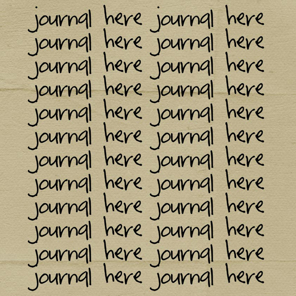
Have you ever noticed that when you journal over heavily textured or crinkled paper that your font doesn't look like you have just written it straight onto the paper. This is because the font isn't flowing across the bumps and folds the way it would if you had penned it with ink. It looks as if it is floating over the folds a little, see what I mean?
In PS there is a way to help the text flow across the paper. If you right click on your text layer and select Blending Options.

This opens the Layer Style Window. We are interested in tweaking the underlying layer. Hold down Alt and hover your mouse pointer over the black triangles. Holding down alt allows you to move just the right-hand black triangle on its own. Slide this towards the middle of the bar. Then repeat with the white triangles on the left, sliding these towards the black triangle. You will have to experiment here, watch how the sliding alters your text layer. Sometimes the triangles have to cross each other sometimes not but as you slide you should begin to see the paper texture come through the font.

Just play with your sliders until you have achieved the result you require. It is a subtle effect but one that I use a lot especially if I am making word tags.

Hope you found this Sunday School useful. Let me know what other tutorials you would like to see covered. have a great week.

No comments:
Post a Comment